Powerful Power BI Tips that BI Company Uses For Creating Meaningful Dashboards
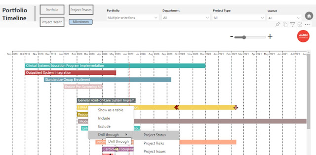
Microsoft Project Dashboard
Reporting Company uses BI tools for developing dashboards that not just add visualizations to data, but also helps in retrieving answers and analyzing critical information.
Using Microsoft's Power BI, you can extract data from a wide range of systems both in the cloud and on-premises to create responsive dashboards. These can be used to track the metrics such as KPIs and drill in to get answers to your questions about your data. You can create rich reports and dashboards which can be seamlessly embedded in you reporting portals or your PowerPoint Presentations. And the users can access them from any location and any device without missing out on any advanced features.
Unlike the traditional form of reporting, these dashboards and reports go far beyond simple tables, pie, and bar charts. However, as a user, you do not need to have the technical know-how and can enjoy vibrant and customized reports.
End-user benefits of Power BI
Visualize your information
You can gather data from different software, applications, and data services, explore on-premise or cloud data, and present the same on one screen. The same reports can be published on your website or on-premise, or shared with other users. Thus, making your company's crucial information ready for decision making.
Let your data tell stories
Using the Timeline Storyteller custom visuals of Power BI, you can use the numbers to show a trend or the change over a period. You can share the history of your business, show its growth over time, how demand is growing, or show anything in which a sequence of events plays a crucial role.
Ask real-time questions
When there are tiles pinned to a dashboard, as a user, you can use the Ask A Question feature; you can get answers to questions asked in natural language based on the tables in the data set. In case you find the question generating beneficial and informative solutions, you can pin them to the dashboard.
Using the same feature, your developer can add featured questions in the dashboard settings.
Customized visualizations
There are multiple charts and graphs available in the Marketplace of Microsoft, which you can use once you sign up for their service. Download the chart that best represents your sector and data set and make the dashboard not only more appealing but also more meaningful.
There are various filter options such as Page level filters, and Report level filters which the developer can use to show only the data which holds meaning to a particular set of stakeholders. Furthermore, as an end-user, you can use slicers to customize the graphs and charts in the report.
For your IT information
You can use Microsoft project dashboard to gage data for IT monitoring tools. Templates for Azure Activity Logs uses the Stream Analytics and SQL database of Azure to collate logs and exhibit the same. Thus, you can visualize and understand the problems along with usage trends. Some templates can also help you to retrieve device details such as configurations, compliance, malware protection levels, client health, software inventory, and server health.


Comments
Post a Comment